The Competition


by Julian Kohann
This web presentation will examine four bibliography products that compete with the Perrla suite.
How do users go from nothing to full bibliography?
Mark Twain once said, "The secret to getting ahead, is getting started." The competitors adopt this in their process. They get the user to cite their first source immediately. The only exception to this is CiteThisForMe, which starts with the bibliography, and then uses the exact same process after clicking "Add Citation" in the MS Word-like menu.
Each of the competitors follow a fairly similar process, taking the user from source to citation. However, there are variances in exact order, visual hierarchy, and presentation that suggest differences in market and user-base.
How do the different sites introduce the user to their product?

Throughout the product, Citation Machine uses numerous large blocks of text to convey helpful information to the user. When a style is selected, a comprehensive guide to the citation format is presented below the source search field. I stopped reading less than 5% through the guide. However, it is possible that Citation Machine caters to a more experienced academic crowd that is used to large amounts of reading. This is also suggested by the moral statement at the bottom of the introduction.
Unlike EasyBib, Citation Machine does not immediately present the type affordance to the user, suggesting that format is more important to their users.

EasyBib has the cleanest interface. It presents the citation style, source type, and a type affordance on the home page in a clean hierarchical way. This immediately demonstrates the value of the site to the user, without overwhelming them.
On the front page, EasyBib indicates that all citation styles, except MLA, require a pro subscription. Users will click to discover the subscription costs $10 a month. EasyBib is unique in limiting users' access to basic citation styles, but they still offer these styles for a premium. This indicates they have a wealthier market than the competition.

CiteThisForMe takes an interesting approach by immediately taking the user to an interface that looks just like Word. For an audience that uses Word heavily, this might be a good approach.
Unlike the rest of the competition, the first step is not displayed as a single text box in the center of the page. It takes a few seconds to understand what the first step is, as there is no visual hierarchy to the options, requiring the user to read through the options.

BibMe, like Citation Machine, starts with only the styles. However, they present instruction in the much cleaner Heading-Blurb format common to the web. I found this easier to follow than Citation Machine's multi-paragraph guides displayed below the initial selection.

Each competitor has a nearly identical process to create a citation. After typing the ISBN or author name into the search field, the user moves through three pages to turn their source into a citation:
This is consistent across the four different platforms. However, the presentation and the levels of guidance vary across the competitors.

Searching and results were similar across the board. Each product had source type tabs directly above the search bar. The user searches, and the results appear below. Each tool displayed the key information needed in the citation.
The single exception was CiteThisForMe, which uses a Word-like menu for selecting source type.

How do the sites let the user know that they could not find everything?

In Citation Machine, it was difficult to immediately understand the purpose of each panel. The headings were not displayed clearly.
This was the single competitor that did not present the information missing from the search results. This made the panel seem pointless. I did not care about what it found, I wondered what it did not find, and was frustrated that this was not presented to me. I ignored everything on the page and scanned to quickly push the next button to learn the information I expected.

I thought EasyBib had the most user-friendly missing information screen. They were the single competitor to signify the missing and found information with colored icons. It seems simple but it is a fantastic move in terms of Emotional Design. It allowed me to anticipate the upcoming work required of me, rather than just reading about it.

CiteThisForMe has a very similar search result page to EasyBib. It comprehensively separates what was found, and what was not. They used red X's and green checks to indicate the result, which gave a clearer emotional message to the user.
The full page of this screen is also cleaner and has fewer distractions than the competitors. Most include ads and FAQs surrounding the functional text.

The "Missing Info" page on BibMe appealed to me. It does not use check and warning icons like EasyBib, but the data representation is still clear.
The text at the bottom did not overwhelm me as much as Citation Machine's text did, as it is hierarchical, visually well separated, and not so long as to discourage reading.
How does the form for filling in missing information look?

After clicking past the breakdown, where Citation Machine does not signify the missing parts, you have to guess which fields to fill in. This is not a big problem because there is not much information to fill out. The panel is off center and small, which is not ideal, but the process generally works well.

EasyBib was the only competitor that highlighted the missing information in bold red. I thought this was fantastic. In the event a user did not remember what was on the last page, they would not need to click the back button, but go directly where their attention is drawn.
At first I thought the blue process guidance line on the left was superfluous, but as I kept using it, I liked the extra clarity it provided.

Compared to the competition, CiteThisForMe's presentation for filling in missing information was small and unclear. The row-based organization was similar to filling out information in Excel, which might be more friendly to Microsoft Office users.
The smaller row-based organization fit on one page, making the required work less overwhelming than the competitors.

BibMe had the largest panel of any of the competitors. The image shown is zoomed out to 50% on my 15" MacBook. It is similar to Citation Machine, but the layout is more central, which provides better focus.
The bibliographies for the different competitors were mostly the same. They showed the citation, and they allowed copy & paste, parenthetical, and other functional necessities for creating a bibliography for an academic paper.


EasyBib was the cleanest and consolidated the important controls. BibMe and Citation Machine both had an "Add Citation" button at the top, while EasyBib had the same box for entering a new citation as seen before, allowing for the quickest return to work.

The most unique competitor was CiteThisForMe. Unlike the other competitors, they used icons to indicate editing controls, rather than text. This made functions less clear.
A positive aspect of the bibliography page of CiteThisForMe was that it was much more consolidated. You always have access to the controls on top, while in the others, general navigation consistently requires scrolling around.

How does the form for creating parenthetical citations look?
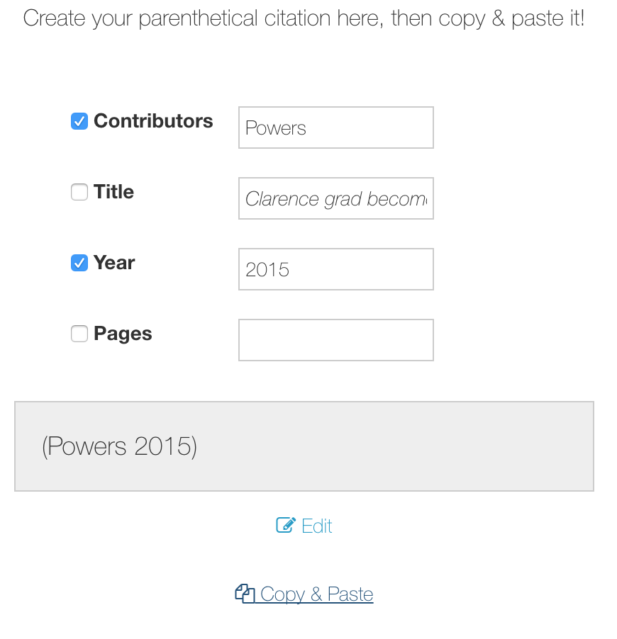
The general form of the parenthetical is essentially identical throughout the competition. With the exception of CiteThisForMe, they follow this process:
It was odd that Citation Machine and BibMe had guidance on every page but this one. How am I supposed to know which checkboxes are appropriate to click?
CiteThisForMe did not have a parenthetical button, but instead simply listed a string under the bibliography entry.

Who offers what for what cost?
Strengths and Weaknesses of Each Competitor
General trends in the different products and analysis
What design trends seem to be implemented across the entire product
After initially choosing the APA citation format, I was presented with a 4615 word guide to APA styling. I would say that it is ridiculous to confront a user with that much text. I was immediately discouraged and clicked through it.
But this may not be a mistake. I have a graduate friend who distracts himself from his homework by reading Wikipedia pages on complex mathematical concepts. It is feasible that they seek to appeal to people like my friend. Perhaps they have a market that is used to that amount of reading: graduates. People that need to write a 20 page thesis would benefit from reading A Comprehensive Guide to APA Styling.
EasyBib was one of my favorite applications to use, because it used colors to communicate and designate necessary input, meaning the user could understand how to use it without reading. It provided an unusual amount of in-UI guidance compared to the rest of the competition. Thus, it required the least effort to use.
Perhaps because it is the best designed application, a surprising number of features were premium. They informed potential users of premium features before beginning. This indicates a higher economic capacity in their market. However, they offer no additional features compared to the competition. The design upgrades and brand must be enough to convince people to pay 10 dollars a month as opposed to to similar quality options like BibMe.
CiteThisForMe was the single competitor that did not follow the same sequence of steps as the other competitors. It was the only one to show the bibliography before a citation was added. Perhaps the initial blank page provides the user with a sense that they will be creating something.
CiteThisForMe was very different from the rest of the competitors because it felt like a desktop application for making bibliographies. Tool panels and a consistently-centered document are common in desktop applications. As an Adobe power user, this application feel drew me in.
Using the application, the user quickly notices the layout is basically Word. Veteran users would be comfortable using it. CiteThisForMe is the only competitor to provide a Word extension.
This is likely the key aspect of their market: people who feel at home using Word.
BibMe's process was entirely identical to Citation Machine. Much of the UI seemed directly copied. While I found Citation Machine frustrating, BibMe was my favorite. It felt clean, simple, and straightforward.
BibMe was an example of how presentation is as important as the process. Don Norman, an intellectual authority on design, believes good design should communicate without words, providing complete instruction on how to use a product, through intuition. The contrast between BibMe and Citation Machine is an excellent example of how drastically a product can be improved, through change in the visual communication and user flow.
Like Citation Machine, BibMe has text guidance on all pages, but it is easier to digest. Therefore they may have a similar, but less academically rigorous market. Perhaps undergraduates instead of graduates. It has been a year and a half since I was an undergraduate, and this definitely was the most appealing to me.
You have told me that Perrla's market consists of less technically adept, non-traditional students, that have more cash on hand than the average undergraduate. It seems like the closest match of a market is somewhere between EasyBib and CiteThisForMe. The in-UI guidance of EasyBib would be an advantage for Perrla. A similarity to Word would also be an advantage for Perrla, as it would reduce the time to learn a new UI.